Your annual conference isn’t just another item on the corporate calendar. If you’re doing it right, it’s a destination—one that people actually look forward to attending, talk about long after it ends, and mark on their calendars before next year’s dates are even announced.
Yet here’s what I see happening in conference rooms across the country: event teams spend months securing speakers, negotiating venue contracts, and building agendas, only to slap together a logo three weeks before launch and call it branding.
That’s not branding. That’s missed opportunity.
The most anticipated annual events aren’t treated as one-off productions. They’re managed like brands—with intentional visual design, consistent messaging, and a point of view that makes them feel distinct and valuable. And that difference? It shows in attendance, engagement, and loyalty.
Your Conference Deserves the Same Strategic Treatment as Your Company
Here’s the truth: corporate event brand identity visual design isn’t just about aesthetics. It’s about creating recognition, building anticipation, and establishing an emotional connection that turns attendees into advocates.
When most people think about branding, they think about their company’s logo, color palette, and website design. Those are critical, but they’re corporate branding—they represent the organization itself. Event branding is different. It’s a subset of your broader corporate identity, but it has its own personality, its own story, and its own reason to exist.
Think about TED. Think about SXSW. Think about the conferences in your industry that people genuinely want to attend. What makes them stick in your mind? It’s not just the content (though that matters). It’s the experience of being part of something with a clear identity. A visual language. A purpose. A brand.
Event Branding vs. Corporate Branding: Know the Difference
Your company brand says, “Here’s who we are as an organization.” Your event brand says, “Here’s what you’ll experience, learn, and become by being part of this community for two days.”
They’re connected—your event brand should feel like a natural extension of your corporate identity—but they’re not the same thing. Your event brand has permission to take more creative risks, to lean into a specific theme or point of view, and to feel more dynamic and forward-thinking than your corporate brand might.
This distinction matters because it frees you up to create something truly distinctive. You’re not bound by every corporate guideline. You have room to experiment with color, typography, and imagery that feels fresh and specific to what this particular conference is about.
At the same time, you’re building on a foundation of trust that your company brand has already established. Attendees recognize the connection, which actually strengthens both your corporate and event identities.
Building Your Event’s Visual Language: The Foundation of Recognition
A strong visual identity for your conference does three things:
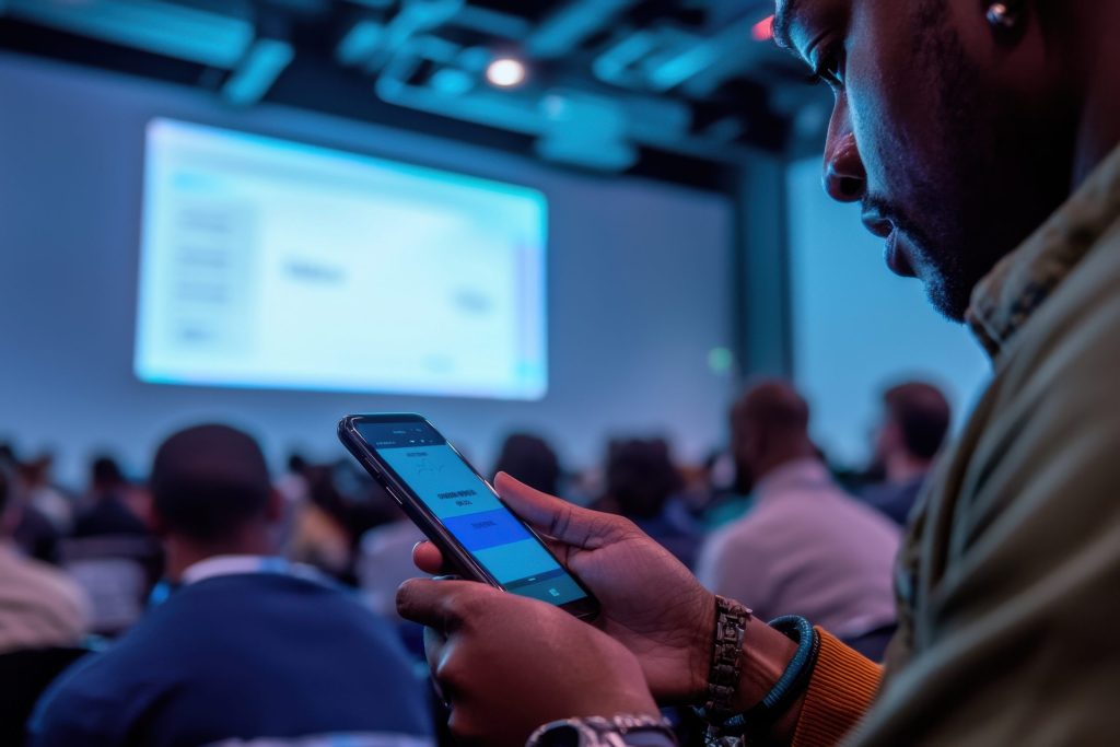
- Creates immediate recognition across all touchpoints—from the email invitation to the conference app to the signage on-site
- Communicates the event’s value and personality before attendees ever walk through the door
- Makes the event memorable long after it concludes, increasing the likelihood that people will return next year
Start with the core elements:
Color Palette
Choose 2-3 primary colors and 2-3 accent colors that feel intentional and specific to your conference. Not generic. Not the same as your corporate brand (unless there’s a strategic reason for that). These colors should feel fresh, appear consistently across every piece of collateral, and photograph well for social media.
Typography
Select a bold headline font and a clean, readable body font. These should work across digital and print applications. The headline font should feel distinctive enough that attendees recognize it instantly when they see it on a promotional email or a poster in the registration area.
Imagery and Iconography
Develop a consistent approach to photography and illustration. Are you using vibrant lifestyle photography? Abstract geometric patterns? Hand-drawn illustrations? Whatever you choose, it should feel intentional and should appear consistently across your marketing materials, signage, app, and printed collateral.
Logo Mark or Event Symbol
This doesn’t have to be complex. It might be a simplified symbol, a distinctive wordmark, or a geometric pattern that becomes synonymous with your conference. The key is that it’s memorable and scalable across every application—from your website to conference badges to social media profiles.
Theme Branding vs. Evergreen Branding: Which Approach Serves Your Conference?
This is where strategy gets interesting.
If your conference has an annual theme—”Resilience,” “Transformation,” “The Future of Work”—then your visual design will be tied to that theme. That’s theme branding. It’s fresh every year, it keeps the event feeling current and relevant, and it creates natural opportunities for refreshed marketing campaigns.
The trade-off? Theme branding requires more design work each year, and attendees don’t develop the same long-term visual recognition they would with a consistent look.
Evergreen branding takes a different approach. You establish a consistent visual language that persists from year to year—think of it as your conference’s signature style. You might change the theme, update the messaging, and refresh supporting graphics, but the core visual identity remains constant. This builds stronger brand recognition over time and makes your conference feel like an established, prestigious destination.
Most mature conferences lean toward evergreen branding with annual theme variations. The core identity stays stable, but you refresh supporting elements each year to keep it feeling contemporary.
Making Your Event Brand Live Beyond the Program
Here’s where most conferences drop the ball: the brand identity disappears the moment the event ends.
A truly strategic approach to corporate event brand identity visual design means creating touchpoints that extend far beyond the conference dates.
Consider this timeline:
- Pre-event: Teaser campaigns, speaker announcements, early-bird messaging—all using consistent visual language
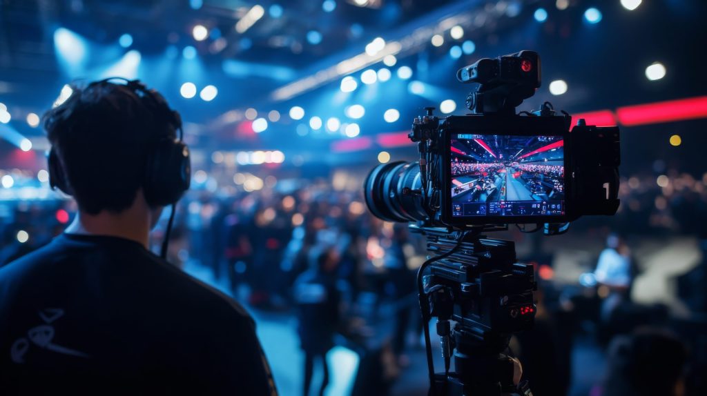
- During event: Registration materials, signage, the conference app, name badges, lanyards—everything reinforces the brand
- Post-event: Follow-up emails with session recaps, social media content featuring user-generated photos, a dedicated landing page featuring highlights and speaker videos, swag packaging with branded elements
- Between events: Email nurture campaigns, social media communities, branded content that keeps the conference top-of-mind during the months leading up to next year’s event
Each of these touchpoints is an opportunity to reinforce your event brand. The cumulative effect? Attendees start thinking of your conference as an annual tradition—a destination they don’t want to miss.
The ROI of Event Brand Investment
I know what you’re thinking: “Investing in a distinct visual identity for one conference seems expensive.”
Here’s the perspective shift: it’s an investment, not a cost. Events with strong, consistent brand identities report higher year-over-year attendance, stronger attendee engagement during the event, and more likely return bookings from sponsors.
When you treat your annual conference like a brand, you’re signaling that it’s important. That it has value. That it’s worth attendees’ time and attention. And that message comes through in every visual element.
Let’s Build a Conference Brand That Feels Like a Destination
Your conference should feel like more than an obligation. It should feel like an experience—one with a clear identity, a consistent visual language, and a reason to attend year after year.
At Conference Innovations, we specialize in helping event leaders create distinctive conference brands that drive attendance and build lasting loyalty. From developing your visual identity to managing every touchpoint from pre-event through follow-up, we know how to make your annual conference feel like the destination it deserves to be.
Ready to transform your conference from a calendar item into a brand that attendees actually look forward to? Let’s talk about your event’s visual identity and strategy. Contact Conference Innovations today to schedule a consultation with our team.
“`